Stained Glass
Spring 2017
Abstract Tile in Glass 3.2

Artist Statement
Working with Stained Glass can be very difficult at times. Simply picking the right colors and making sure you have enough of it can be a challenge. Multiple times I broke specific pieces and had to start over. Although my first piece only has nine pieces, it took be a while to get it right because I was so new to the process. I had to cut each piece with extreme precision, then grind them down so the edges are smooth and each piece fits together. I did have some small gaps in between pieces, but I was able to fill them in with the silver solder. The hardest piece for me to make was the circle. I had to make sure it was perfect so all the other pieces would fit together perfectly. In the future projects, I will make sure to take my time on each piece so the end product looks clean, polished, and perfect.
I am happy with my design because I feel like I created emphasis between the pieces. I wanted to pick an array of different colors in order to make the piece look different. Also, the solder between the pieces make each color pop, so your attention travels around the whole piece. As I continued with my process, I had to make some slight edits in order to make all the pieces coherent, but my final product matches my original design.
Art Nouveau 4.7

Artist Statement
This project was much more difficult than our first. My first project only had nine pieces, while my second had almost 50. Although the overall design was bigger than my first, I still had tiny pieces in order to fill in gaps that that solder couldn't. I first started with a design inspired by the art nouveau era, which lasted from the late 1800s to the 1920s. During this era, everything was floral and based on nature, creating curved lines instead of straight lines. My glass tile is made up of three flowers with petals and stems, and curved background pieces of clear glass which will allow light to come through. I started with my border pieces, the blue pieces, because they were the most simple and I could base the rest of my design around them. I then created the three flowers because they were the focal points of the design, and I wanted them to be my main priority. The rest of the background, clear, pieces were adjusted as I went according to the flowers. I struggled with the last background pieces because I had to adjust them the most. I couldn't change the flowers because I had already grinded them. Once all of my pieces mostly fit together, I had to clean them with the rubbing alcohol. Next I'll have to put foil around all of them and then solder them together.
I think my design represents the art nouveau era pretty accurately. It is full of curved lines and flower and floral shapes, which is what defined the era. I made the flowers bright and vibrant colors so that the attention would go directly to them. The light will also travel through all the pieces to brighten it up. I made the petals on the flowers different colors and shapes to create contrast and emphasis. I chose the border it be blue because it is a color that goes with everything, and it wouldn't draw attention away from the main points, which it the flowers. I had to change some of my pieces so they could fit overall, and I had to eliminate some pieces from my original template because they were going to be too difficult to cut, grind, and it was extra work that didn't add much to the effect I wanted my piece to have.
Stained Glass Votive 5.8

Artist Statement
Depending on color, opaque vs. transparent glass, the light coming through it will look different. Also, when using different colors, the light coming through it can make the piece itself look different. When making a votive that incorporates light, using a variety of colors and transparency levels in the glass can make the piece overall pop.
My original idea was to make something simple, because I didn't have a lot of time left. I wanted to use simple shapes, like squares and rectangles to make the piece look simple but precise. When it came to colors, I had used a lot of yellows and oranges and greens in my previous work, so I wanted to use different colors like blues and purples, but with variation in those colors. I had a lot of challenges with my work. It was hard to make every single side identical, and it was hard to solder because one side would be a little thinner and one would be too tall, which make it hard have it look just right. We also didn't have a lot of glass left since it it the end of our glass, so finding a piece that would match the esthetic of my piece and be large enough was a challenge on its own. Luckily, one of my friends had leftover clear glass from her piece that she let me use. I also had another project that I was working on, and I chose to catch up on that instead of working on my votive, which put me behind. However, I used my free blocks to finish it the best way I could.
Mosaic 6.12

Artist Statement
I think mosaic is an art form because people who create it have a plan and they create designs with the mosaics. Mosaic is one of the oldest forms of visual expression and is seen in various civilizations throughout the world. This is because people have been using different materials around the world throughout history, such as rocks, stones, pebbles, and even glass.
My idea for my piece was a sunset. Originally I was going to either use one big canvas or one small one, but they both were to extreme of sizes. I decided to combine two small ones to create one sunset that would be split in half. I felt a little rushed at the end of this project so some of the pieces weren't as shiny, so I wish I had more time to make it look better, but I tried to get it done as quickly as possible in order to finish it in time for the project deadline.
Art Fundamentals
Fall 2016
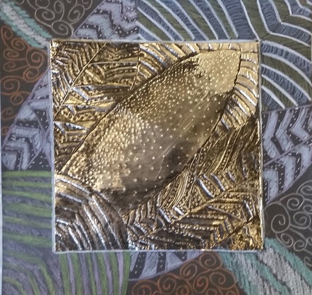
Zentangle Foil Embossing 9.30
Artist Statement
Foil Embossing has been used in many different ancient civilizations such as the Egyptian, Greek, and Roman. Each group used foil embossing differently. For example, the Egyptian would emboss masks for their leaders when the died, and the Greeks used foil embossing to make shields and armor. The inspiration for my zentangle design was a sunflower. I went outside in the garden and looked at the leaves and flowers around, saw the sunflower, and thought I could make an interesting design from it. I used mainly different types of stripes in the design because I felt like using simple design elements that I see everyday would make it easier for me to create and other people to understand what I was doing. First I created a simple outline, then printed it onto the foil. After I added the other design elements on the foil before I taped the foil onto black construction paper and continued the design outward and added color. Finally, we inked the foil which gives it an older look. I used several of the elements and principles of design, including color, shape, and balance. You can clearly see the different colors on the black construction paper because they really pop. I feel like I did an good job creating a nice piece of art work. I feel like the colors I used make the overall piece pop, and using different design elements made everything come together. The most challenging part of creating this piece was coming up with different ways to fill in space. However, I just thought of other types of designs and patterns and filled in the empty space.
Competencies
VPA 1: Create artwork using various media, tools, techniques and processes safely and appropriately
Score- 3 Because I feel like I created my art with many different tools and techniques to create my art the best ways that I could.
VPA 2: Demonstrate an understanding of various composition skills, including the Elements of Art and Principles of Design, through the creation and analysis of artwork.
Score- 3 Because my piece shows that I used many different aspects of the Elements of Art and Principles of Design to create an artwork that meets the standards.
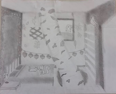
A Room Transformed 10.25
Artist Statement
"The art of drawing solid objects on a two-dimensional surface so as to give the right impression of their height, width, depth, and position in relation to each other when viewed from a particular point," is the definition of perspective. It is useful because with out it, objects drawn on paper would not look realistic. Perspective allows artists to create realistic objects and spaces. I chose to transform my space into a forest theme. It began when I drew a normal room, and I noticed I had a lot of empty space where the tree is. I drew the tree and then added other things that would be found in a forest, such as the acorns, bird, and chipmunks. I also wanted the space to feel like you were in the forest. I drew the objects in the room with my own twist, such as the chipmunks and birds are kind of cartoon-like.
Making the whole room look realistic was actually really difficult. The making all the walls the right value was difficult because I started with a dark wall, then I had to shade everything else in the room so it matched the wall. However, I think I persevered throughout the challenges by telling myself that I could figure it out. I think my concept for my space was different than anyone else's becauseI added different objects, and the tree in the middle really pops and makes the space unique.
Competencies
VPA 1: Create artwork using various media, tools, techniques and processes safely and appropriately.
Score- 3 Because I used different shading techniques and pencils to create my artwork. I also did use the internet and my peers for inspiration without directly copying them.
VPA 2: Demonstrate an understanding of various composition skills, including the Elements of Art and Principles of Design, through the creation and analysis of artwork.
Score- 3 Because my piece shows that I used many different aspects of the Elements of Art and Principles of Design to create an artwork that meets the standards, such as using different values.
VPA 6: Apply creative and critical thinking skills by using the creative process to develop solutions to complex problems.
Score- 3 Because I used different ways of problem solving to persevered through creative blocks and struggles while creating my piece.
Doodle For Google 11.3

Artist Statement
I chose the topic better education for the theme "What I see for the future" because I want to see education access to children all over the world and in the U.S. I think it responds to the theme because I used classic education symbols, such as the school bus, apple, and books. I also added a backpack as the G because I feel like when people see a backpack the first thing they thing of is school. Overall I think my design shows "What I see for the future" because it shows that I hope all children around the world can have access to education and the necessary supplies.
I chose the topic better education for the theme "What I see for the future" because I want to see education access to children all over the world and in the U.S. I think it responds to the theme because I used classic education symbols, such as the school bus, apple, and books. I also added a backpack as the G because I feel like when people see a backpack the first thing they thing of is school. Overall I think my design shows "What I see for the future" because it shows that I hope all children around the world can have access to education and the necessary supplies.
Personal Logo Prints 12.12

Artist Statement
Logos for companies are designs that catch peoples eyes. They represent the company and are often simple but effective. For my personal logo, I wanted it to keep it simple, but I couldn't think of one symbol. Both of my initials are M's so I decided to have one large M with my first and last name spelling off it. The 'EST. 2002' is the year I was born so I wanted to incorporate it into my logo. The screen printing process was difficult. First, I wrote my logo backwards so I had to erase and redo it. Then some of the ink washed of so I had to paint a lot of the letters by hand. However, it was fun and exciting because I had never done anything like it before.
Competencies
VPA 1: Create artwork using various media, tools, techniques and processes safely and appropriately
Score- 3 Because I feel like I created my art with many different tools and techniques to create my art the best ways that I could.
VPA 2: Demonstrate an understanding of various composition skills, including the Elements of Art and Principles of Design, through the creation and analysis of artwork.
Score- 3 Because my piece shows that I used many different aspects of the Elements of Art and Principles of Design to create an artwork that meets the standards.
VPA 4: Demonstrate the understanding of the interdisciplinary and life applications of the visual arts.
Score- 3 Because I can identify and understand the interdisciplinary and life applications and their relationship to the visual arts.
VPA 5: Demonstrate visual literacy using symbolism and aesthetic design choices to communicate ideas and feelings.
Score- 3 Because I was able to use different symbols to communicate my ideas effectively and create a functioning logo.
VPA 6: Apply creative and critical thinking skills by using the creative process to develop solutions to complex problems.
Score- 3 Because I was able to critically think and use my creative process in order to create the perfect logo.
Symbolic Portrait 12.14

Artist Statement
This portrait is a drawing of my friend. I chose to draw her because I had a lot of photos of her on my phone and in my memory. I chose the designs in the background because they all represent her and the things she likes. She like coffee, her star sign is a Virgo, and the shopping bags are there because she likes to shop. In the drawing, I used different values for the shading in her hair and on her face. I also used the space I had properly by putting the objects in the places they would be most effective.
I think parts of my work were successful and others were not. I think the shading on her face could have been better, but I am proud of the shading in her hair. I am also proud of the way I placed the objects in the background because space is filled up and there aren't a lot of white, blank space. If I were to do this project again I would have spent more time with the details of the shading and I also would have added more things in the background.
Competencies
VPA 1: Create artwork using various media, tools, techniques and processes safely and appropriately
Score- 3 Because I feel like I created my art with many different tools and techniques to create my art the best ways that I could.
VPA 2: Demonstrate an understanding of various composition skills, including the Elements of Art and Principles of Design, through the creation and analysis of artwork.
Score- 3 Because my piece shows that I used many different aspects of the Elements of Art and Principles of Design to create an artwork that meets the standards.
VPA 5: Demonstrate visual literacy using symbolism and aesthetic design choices to communicate ideas and feelings.
Score- 3 Because I was able to use different symbols to communicate my ideas effectively and create a realistic portrait.
VPA 6: Apply creative and critical thinking skills by using the creative process to develop solutions to complex problems.
Score- 3 Because I was able to critically think and use my creative process in order to create the perfect portrait.
Silhouette Painting 12.22

Artist Statement
The analogous colors are colors that are next to each other on the color wheel. For example, red, red-orange, orange. I think I blended the colors well because the blue and the red don't look weird next to each other and they don't look like stripes. I blended some purple between them so the analogous colors are well blended. I actually made another piece before, but I didn't blend it well and it looked like separate lines rather than a cohesive skyline. I also added some stars and a moon because they made the painting more realistic. I chose a city skyline because I found a photo on my phone that I took of Chicago. I thought it would be simple but it would look cool. I added the stars and the moon to make the background pop more because I made the buildings to high up on the paper so the bottom inch or so is just black. However, I am really proud of this piece because I tried really hard on it and it came out really cool looking.
The analogous colors are colors that are next to each other on the color wheel. For example, red, red-orange, orange. I think I blended the colors well because the blue and the red don't look weird next to each other and they don't look like stripes. I blended some purple between them so the analogous colors are well blended. I actually made another piece before, but I didn't blend it well and it looked like separate lines rather than a cohesive skyline. I also added some stars and a moon because they made the painting more realistic. I chose a city skyline because I found a photo on my phone that I took of Chicago. I thought it would be simple but it would look cool. I added the stars and the moon to make the background pop more because I made the buildings to high up on the paper so the bottom inch or so is just black. However, I am really proud of this piece because I tried really hard on it and it came out really cool looking.
Final Project 1.20

Artist Statement
For my final project, I chose the song "Rehab" by Amy Winehouse. I thought it would be able to find and draw symbols from the song. I created an empty room with a single person and a clock to represent time. I also added a calendar to represent time going by. I added in quotes from the song to connect the objects in the room back to the lyrics from the song.
For my final project, I chose the song "Rehab" by Amy Winehouse. I thought it would be able to find and draw symbols from the song. I created an empty room with a single person and a clock to represent time. I also added a calendar to represent time going by. I added in quotes from the song to connect the objects in the room back to the lyrics from the song.
